Pauline Yong Blog
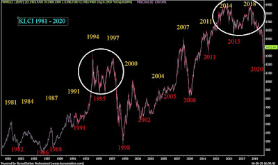
KLCI Historical Chart 1981 - 2020
pauline_yong
Publish date: Sat, 16 May 2020, 05:13 PM
It is our belief that history repeats itself in the stock market because human nature and investor psychology don't change. Therefore, analyzing historical charts can be a helpful guide for interpreting current and future market trends.
Personally I pay close attention with the KLCI historical data and charts. A few years back, while many were forecasting the next stock market crash was in 2018 but I had a different view. I was comparing the relationship between the Malaysia stock market with the GDP growth rate and based on the figures (if history were to repeat itself) the next market crash should not be 2018 but a much later date. I will not disclose the year but to let yourself do the calculation.
The diagram above showed KLCI 1982 to present. The 2 circled represent some similarities despite it is 30 year apart.
- The bullish years are: the year ending with 1,4,7 (with + or -1 yr)
- The bearish years are: the year ending with 2,5,8 (with + or - 1 yr)
The above are just my personal opinion, there is no guarantee that it will occur as stated above. Nevertheless, it is no doubt very interesting to study the history in order to have a better understanding of how our stock market works.
FB: https://www.facebook.com/paulineyong123/
Instagram: https://www.instagram.com/paulineyong...
Website: alphaacademy.biz
Instagram: https://www.instagram.com/paulineyong...
Website: alphaacademy.biz
*****************************************************************************
Books by Pauline Yong : https://www.alphaacademy.biz/books
Share Investor Fundamental + Technical Analysis for Bursa Malaysia https://www.shareinvestor.com/membership/plans_webpro.html
Discount Code "mypycode"
More articles on Pauline Yong Blog
Candlesticks vs Heikin Ashi #Trading #PaulineYong #ILoveStocks
Created by pauline_yong | Feb 09, 2022
Women Investing: Build Your Portfolio In 5 Easy Steps #Bursawebinar #stockinvesting #paulineyong
Created by pauline_yong | Dec 15, 2021
How To Apply ESG Investing in Bursa Malaysia Stoks (Environment Social Gorvenane)
Created by pauline_yong | May 04, 2021
A Powerful Technical Indicator For The Value Investors - GMMA
Created by pauline_yong | Apr 30, 2021


