


KLSE Stocks Review
YTL (0025) The Story behind the Chart of YTL CORPORATION BERHAD

ChartStory72
Publish date: Thu, 05 May 2022, 03:40 PM
ChartStory72
0 211
We post FREE chart reviews on KLSE daily Top Gainers and Most Actively Traded Counters. We are also giving out free reviews for our subs as well. Come join us on Telegram and PM us to learn more and request for the stocks you need reviewing for FREE.
Facebook : https://www.facebook.com/thechartstory
Telegram : https://t.me/thechartstory
Facebook : https://www.facebook.com/thechartstory
Telegram : https://t.me/thechartstory
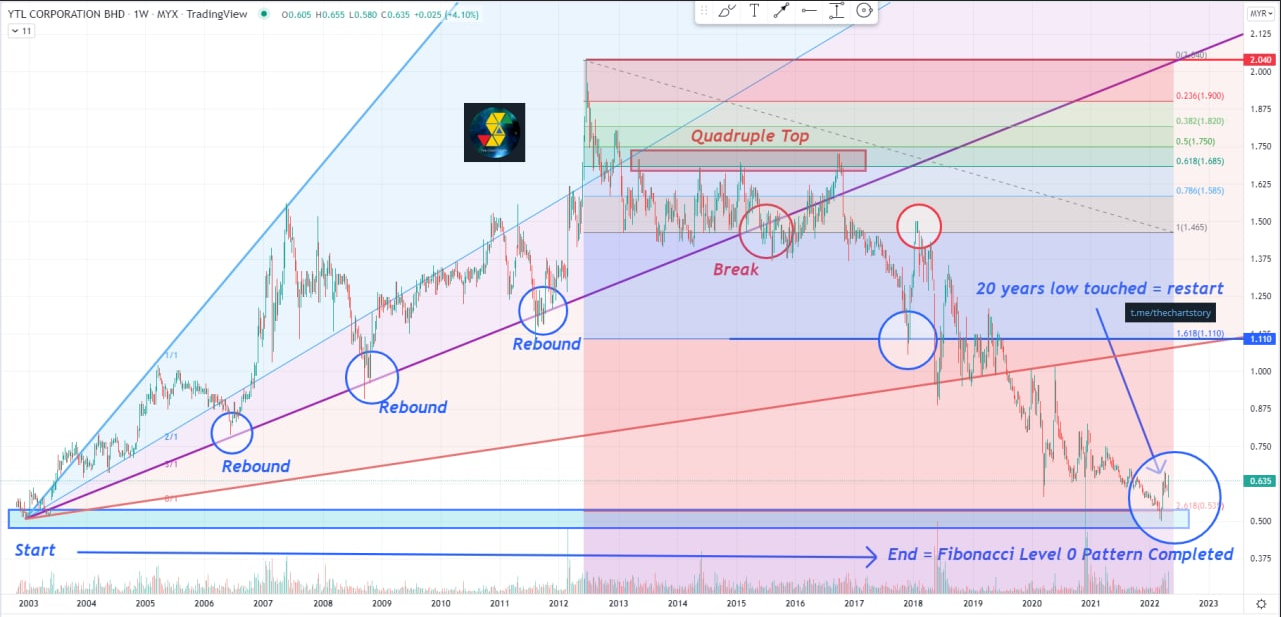
YTL 4677
Weekly Timeframe
Prepare yourself as this will be a very long story.
The ever first time we get to trade YTL on KLSE is about 20 years ago at 2002 October. The lowest prices ever went after the opening is at 0.51. Last month, we are lucky enough to finally see prices went all the way back towards it's 20 year low. Lucky? Why? This is because the Fibonacci Pattern had completed and for now prices are unlikely to trend down lower anymore as it is at a 20 year low and the 20 year plan by the bankers are finally over. This indicates limited downside with unlimited upside. However, throughout this 20 years, there are many things we can learn and understand how this whole 20 years stock movement had been a plan all along !
Now let's look at the past 20 years and see how did the bankers planned this all along right Infront of us and we are just too blind to see. Now pay attention at the begining of 2003 (Time Fibonacci Level 0), prices immediately dropped lower after the opening where everyone is selling showing no interests at the company at all, which is what the bankers wanted all along. After the drop, prices proceed to go on a massive uptrend for 10 years (Time Fibonacci Level 0.5) increasing from 0.51 to 2, which is about a 400% increase. Everything is going very well for the company, which helps build their portfolio and financial statements as well. Company's trustworthiness is increasing, and piqued many investor's interest to buy their shares to invest.
However, when everything is looking good, the nightmare begins whereby things started to slow down and prices went on a massive range for 4 years straight (Distribution Stage), whereby it's a good time for the bankers and shareholders to take their profits, slowly selling millions of their shares towards the public with their past 10 years of good results and selling that they will do better in the next 10 years. A normal investor for have bought their 'show', however for someone who is smart enough would have know it's all just for show and the uptrend had ended long time ago. But how? Now pay attention at the Gan Fann Level 3/1. Every 3-4 years, prices will rebound at that level indicating the uptrend is still strong, however prices broke that level by the end of the range indicating a first signal that the bankers are selling hard, if that is not enough, prices proceeds to form a Quadruple Top which marks the beginning of a massive downtrend (Time Fibonacci Level 0.618).
Now in order to complete the their final wave, prices needed to touch 2 important levels which are the Golden Ratio Levels, 1.618 and 2.618. The first wave down had completed rather fast, prices touches the 1.618 level and rebounded massively creating a 'fake' uptrend continuation, this is the last 'trap' set by the bankers to 'promise' investors that the stock is still on an 'uptrend'. Investors flock to buy more shares and finally the real crash begins. Prices begins to crash like nobody's business and finally reaching the end road by this year 2022 March, 2.618 + Fibonacci Level 0, which is also Time Fibonacci Level 1.
Now why the long story? Stock movements are like waves, often the future of price movements had already been planned many years back and today we are fortunate enough to see it happen, which gave me an opportunity to share this long story to my fellow viewers and allow all of you supporters a deeper understanding on stocks and Fibonacci waves, because prices are just not as easy as support/resistance and a good 10 year financial statement. It requires a more deeper understanding on waves and numbers. From what we learn today in the history of a 20 year plan from YTL applies to many other stocks as well. To understand the future we need to understand the past because 'History always repeat itself'. However, it is always easier said than done. You have to truly ask yourself, are you smart enough to see it before it happens again?
Thank you for reading.
Come join us on Telegram and PM us to learn more and request for the stocks you need reviewing for FREE. We also post other extra contents that we do not share here, which includes weekly recap and weekly analysis.
Telegram : https://t.me/thechartstory
In this fast-moving digital world, we get information in a few clicks.
However, we rarely get first-hand information and more often we get misleading news.
Investing in stocks today is very different from the past, but one thing hasn't changed - to study about a stock before putting money in.
A stock chart contains data that is publicly available and accurate by itself. By having certainty in data quality, we can comfortably study charts and make investment judgements.
At Chart Story, we believe stock prices move for a reason. Our objective is to share what we believe.
More articles on KLSE Stocks Review
DSONIC (5216) The Story behind the Chart of DATASONIC GROUP BERHAD
Created by ChartStory72 | Apr 18, 2022
FRONTKN (0128) The Story behind the Chart of FRONTKEN CORP BHD
Created by ChartStory72 | Jan 18, 2022
ANNJOO (6556) The Story behind the Chart of ANN JOO RESOURCES BHD
Created by ChartStory72 | Jan 17, 2022
EVERGRN (5101) The Story behind the Chart of EVERGREEN FIBREBOARD BERHAD
Created by ChartStory72 | Jan 11, 2022
TEXCYCL (0089) The Story behind the Chart of TEX CYCLE TECHNOLOGY (M) BERHAD
Created by ChartStory72 | Jan 10, 2022
Wong (7050) The Story behind the Chart of WONG ENGINEERING CORPORATION BERHAD
Created by ChartStory72 | Jan 03, 2022
TOPGLOV ( 7113) The Story behind the Chart of TOP GLOVE CORP BHD
Created by ChartStory72 | Dec 06, 2021
Discussions
Be the first to like this. Showing 0 of 0 comments
Post a Comment
Featured Posts
Open a Moomoo Account Today and Win an Apple iPad Air*!
Apps


Top Articles
1
2
3
4
5
AmInvest Research Reports
7
8
#
Stock
Score
Daily Stocks
Stock Name
Last
Change
Volume
Stock Name
Last
Change
Volume
Stock Name
Last
Change
Volume
MQ Trading Signals
Stock
Time
Signal
Duration
Stock
Time
Signal
Duration
Featured Advertisers / Partners


Ride The Bull Short The Bear
CS Tan
4.9 / 5.0
This book is the result of the author's many years of experience and observation throughout his 26 years in the stockbroking industry. It was written for general public to learn to invest based on facts and not on fantasies or hearsay....