


Future Tech
Google rebrands 'android' as 'Android' to remove any doubt about its affiliations

LOGOWATCH Google may have felt that 12,000 of its workers were surplus to requirements, but the search and ads giant has clearly kept plenty of designers on staff - someone at the Big G has found time to redesign logos for the Android operating system and associated frippery.
Android last received a glow-up in 2019 when Google decided to change colors and names that weren't accessible to all. Out went dessert-themed names for new versions of the OS, while some green elements were changed to black to help the visually impaired.
This time around, Google reckons the global population of three billion Android devices should be reflected in logos that "reflect Android's core ethos of being open, iterative and inclusive."
The new logo was designed to "complement the Google brand palette" and does so by adding a capital A to the operating system's logo. Here's how that looks.
Jason Fournier, director of Android Consumer Brand Management, wrote that the change elevates the logo and gives "more weight to its appearance when placed next to Google's logo."
"While we've added more curves and personality unique to Android, the new Android stylization more closely mirrors Google's logo and creates balance between the two," he added, before expressing "hope these small but significant updates to the Android typeface will better communicate the relationship between Android devices and the Google apps and services people already know."
A reminder: open source cuts of Android exist, and it's very possible to run Android without Google apps - though few handset manufacturers make an attempt to do so. The relationship between Android and Google is therefore already very tight, regardless of typefaces.
The logo update also impacts the "Bugdroid" - the cartoonish robot Google uses to anthropomorphize its OS.
The Bugdroid has been given "an entirely new 3D look."
In Fournier's words the mecha-creature is now "as dynamic as Android itself" and has gained "more dimension, and a lot more character." OK.
It's also gained some new personalities that Google thinks represent the diversity it's keen on. Among the variations it's shown off are rainbow Bugdroid, furry Bugdroid, glitterball Bugdroid, construction-helmet-wearing Bugdroid, and something The Reg's LogoWatch desk thinks might be either punk/mohawk Bugdroid or cartoon monster Bugdroid.
Readers looking for Bugdroids that resemble their appearance, occupation, or age group, appear to be in for disappointment.
Google nonetheless asserts Bugdroid "can easily transition between digital and real-life environments, making it a versatile and reliable companion across channels, platforms and contexts."
Which must be a comfort to those 12,000 former Googlers. ®
https://www.theregister.com//2023/09/06/logowatch_google_android_rebrand/
More articles on Future Tech
Legal eagles target Intel for class action over cooked Raptor Lake CPUs
Created by Tan KW | Aug 02, 2024
Bring the hammer down on Nvidia, US progressive and antitrust orgs urge the Feds
Created by Tan KW | Aug 02, 2024
Too late now for canary updates, says pension fund suing CrowdStrike
Created by Tan KW | Aug 02, 2024
Is AI going to pay its way? Wall Street wants tech world to show it the money
Created by Tan KW | Aug 02, 2024
FBI, CISA remind US voters that DDoS attacks can't touch election systems
Created by Tan KW | Aug 02, 2024
India's Ola Electric IPO attracts $2 billion of bids from big institutions, source says
Created by Tan KW | Aug 02, 2024
Discussions
Be the first to like this. Showing 0 of 0 comments
Post a Comment
Featured Posts
Introducing MY's First IPO Fund for Sophisticated Investors!
New Update. Discover investment communities that resonate with your ideas
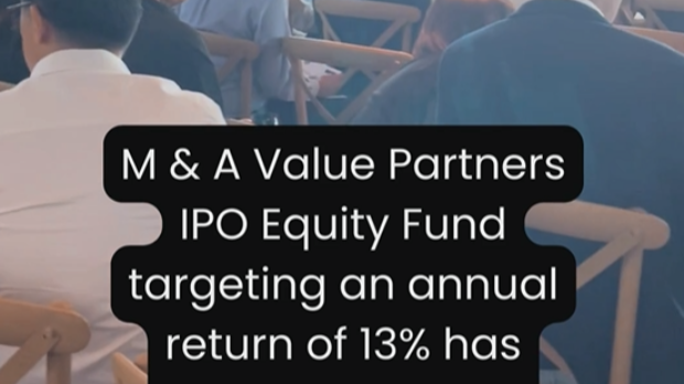
M & A Value Partners IPO Equity Fund has been launched - Targeted 13% Return p.a
Latest Videos


Apps


Top Articles
1
Stock Pick Contest Year 2024
2
3
4
save malaysia!
5
6
save malaysia!
7
https://dividendguy67.blogspot.com
8
#
Stock
Score
Daily Stocks
Stock Name
Last
Change
Volume
Stock Name
Last
Change
Volume
Stock Name
Last
Change
Volume
MQ Trading Signals
Stock
Time
Signal
Duration
Stock
Time
Signal
Duration
Featured Advertisers / Partners


Ride The Bull Short The Bear
CS Tan
4.9 / 5.0
This book is the result of the author's many years of experience and observation throughout his 26 years in the stockbroking industry. It was written for general public to learn to invest based on facts and not on fantasies or hearsay....